When to hide data
Today Wed 19th March 2025. I was working on what is a techncially very simple feature, but has a big impact on readability.
In MuDG, I added a feature to read the graph as a threaded conversation (a more linear, familiar format). This feature allows users to navigate the graph more easily and understand the relationships between nodes.
The first version of this was just rendering the nodes as a flat list indented to represent depth. This morning, I added a simple toggle to hide and show text and a button to expand / collapse all nodes.
I think the result is quite satisfying. The toggle allows users to focus on the structure of the graph without getting overwhelmed by the text, while the expand/collapse button provides a quick way to explore deeper levels of the graph. This makes it easier for users to understand the relationships between nodes and navigate the graph more efficiently.
Compare below with the previous version:
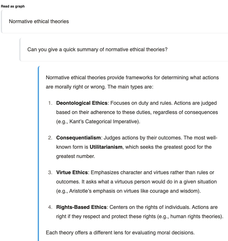
Before:
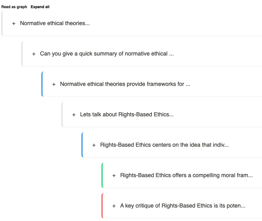
After:
Main Points
Key Insight 1: Less is Often More
One of the most counterintuitive principles in data visualization and UI design is that showing less information can actually enhance understanding. When users are presented with too much data simultaneously, they experience cognitive overload - their attention fragments, key patterns get lost in the noise, and the mental energy required to parse everything leads to fatigue and frustration. In MuDG, allowing users to hide text content while maintaining the structural outline serves two important purposes. First, it lets users grasp the overall shape and flow of the conversation graph without getting distracted by the content details. Second, it allows them to selectively focus on specific parts of the conversation that interest them most. This selective attention is far more natural to how humans process information - we tend to zoom in and out, alternating between overview and detail.
Key Insight 2: User Control Creates Investment
Giving users control over what data they see transforms them from passive consumers to active participants. Each decision to expand a node or collapse a section becomes a micro-investment in understanding the data. This sense of agency is powerful - users who feel in control of their experience tend to be more engaged, spend more time with the application, and develop a better grasp of complex relationships. The expand/collapse all feature provides a useful shortcut, but the real magic happens when users make thoughtful decisions about which parts of the conversation to expand. This creates a personalized journey through the data that aligns with their specific interests and questions. It’s worth noting that this approach works particularly well for graph data, where hierarchical relationships benefit from progressive disclosure.
Key Insight 3: Context Transitions Need Careful Design
What I found particularly interesting while implementing this feature was how important the transitions between states became. When a node collapses or expands, maintaining the user’s sense of place and continuity is crucial. Abrupt changes can be disorienting, while thoughtfully designed transitions reinforce the user’s mental model of the data structure. The decision about what preview information to show when a node is collapsed becomes a critical design choice. For MuDG’s conversation view, showing just enough text to identify the topic of a collapsed node, along with visual cues about its depth and connection to other nodes, provides the perfect balance of information density. Too little context and users can’t make informed decisions about what to expand; too much and we lose the benefits of hiding data in the first place.
Keywords: Today, 19th, March, 2025, working